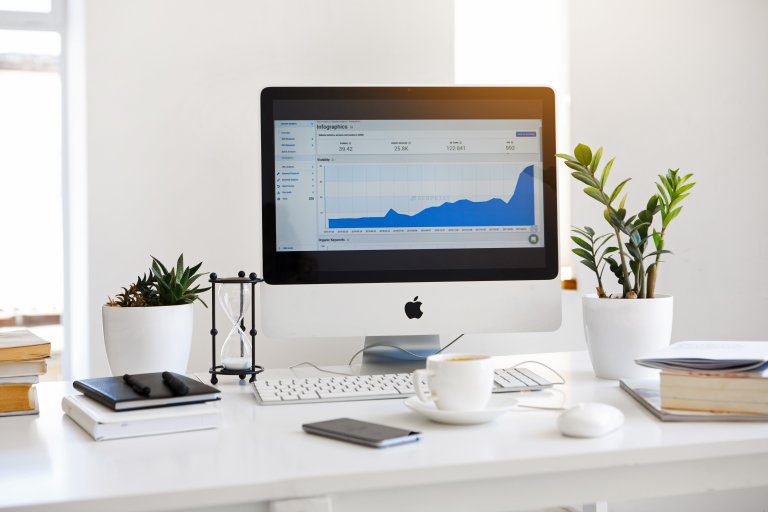
How do you display results properly on a dashboard?
In daily life, we often use dashboarding without realizing it. Think of Google Analytics’ dashboard or Fitbit’s dashboard. Working with a dashboard offers many advantages, but how do you properly display results in a dashboard?

What is dashboarding?
Dashboarding is a convenient way where you can view and analyse various data at a glance. Similar to the dashboard in your car, it allows you to get a picture of the state of your company/project/personnel/etc. and to manage it. If there are problems with your project, for example, the dashboard allows you to easily see where the problem lies and, if necessary, which activities need to be carried out to solve it.
What does a dashboard look like?
A dashboard is divided into two types of indicators, which are: the leading and lagging indicators. The leading indicators are the actions you do and the lagging indicators are the results you achieve as a result. For example, a leading indicator for your LinkedIn success is the number of posts you have placed in a given period. The related lagging indicators are, for example, the number of likes and comments.

Benefits of using a dashboard
Making data understandable: instead of rows and rows of data in excel, a dashboard ensures that complex data is displayed (visually appealing) in a clear form. An endless table is difficult to interpret. A green number, on the other hand, clearly indicates the status immediately.
Ensures commitment: In large projects, many employees work together on one result. It can only occur that some employees feel less engaged because they are not kept informed. If you develop a dashboard that measures progress against targets, you ensure that the whole team stays involved in the project.
Speeds up decision-making: A dashboard allows a manager to check progress, this allows management to make quick judgements about a project.
How do you properly display results in your dashboard?
A dashboard is a visual representation where everyone involved can quickly and clearly understand the information. An example of this is the use of the traffic light effect. If the traffic light is green then it is clear that there is no problem here and it will not be necessary to pay extra attention to this. However, if the traffic light turns yellow or red, action must be taken.
The most important information: Each piece of information can be of interest to another person. Check with yourself what the target group of the dashboard is and which information is relevant.
Start with a purpose: It is extremely important that a dashboard has a purpose. This goal is your starting point to determine whether the results are going well. Don’t collect information and data just so you have the information. You also need to do something with this information.
Display on one screen: It is important that you can display the information you collect on one screen. This summary provides a clear overview of the statuses.
The F-form: Anyone who has been working with optimizing websites for some time is familiar with the F-form. The F-shape is exactly what human intuition is when they see information on a screen. Start at the top left with the most crucial information. The least crucial information at the bottom right.
Would you like more information about how we do dashboarding? Then click below.

Martijn Bredewold
Data Scientist